

The Color Wheel Explained: Finding Perfect Matches
How to Pair Colors for Balance, Contrast, and Style
Colors have a way of shaping perception, influencing emotions, and guiding attention, yet choosing the right combinations can sometimes feel like guessing in the dark. The color wheel serves as a reliable compass in this process, a visual tool that maps out relationships between hues and makes it easier to see which shades naturally complement one another. By understanding the position of colors on the wheel, it becomes possible to identify harmonies, contrasts, and subtle pairings that bring designs, spaces, and visuals to life. What might seem random at first can quickly become an organized palette, guided by principles that artists and designers have relied on for centuries.
Complementary colors, which sit opposite each other on the wheel, create energy and strong visual impact. Think of deep blue paired with a warm orange or a rich red alongside a fresh green. These combinations grab attention and provide a dynamic balance that feels exciting yet intentional. On the other hand, analogous colors, positioned side by side, offer harmony and flow. Soft yellows blending into greens or gentle blues merging into purples produce a cohesive, calming effect that is often used in branding, interiors, and illustrations. Both approaches demonstrate how the wheel can serve as a roadmap for deliberate and striking choices.
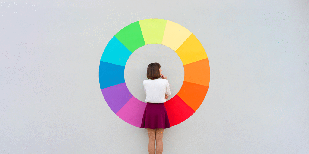
Triadic color schemes add another layer of versatility. By choosing three colors evenly spaced around the wheel, it is possible to create combinations that are vibrant without feeling chaotic. A palette of red, blue, and yellow, for instance, can inject energy into a project, while purple, green, and orange offers an equally balanced alternative. Split-complementary options, meanwhile, introduce subtle contrast without the intensity of direct complements, giving designers more nuanced control over the overall feel. These methods highlight how understanding spacing on the color wheel translates into practical design decisions.
Monochromatic and tetradic combinations demonstrate the flexibility of color theory. Using shades and tints of a single color can create depth, mood, and cohesion, ideal for minimalist designs or projects where simplicity is key. Tetradic combinations, which involve two complementary pairs, allow for a rich variety of colors while maintaining harmony. By adjusting dominance and balance among these colors, it is possible to emphasize certain elements, guide focus, and keep the overall palette visually appealing. With practice, these principles become second nature, turning the abstract wheel into an intuitive guide for creative expression.
At the end of the day, the color wheel is more than a tool; it is a bridge between imagination and execution. It helps transform ideas into visual realities, providing confidence in every choice, whether the goal is to evoke warmth, create contrast, or maintain subtlety. By referencing it when planning projects, artists, designers, and even casual creators can experiment freely while knowing there is a logical foundation supporting their selections. From selecting a harmonious living room palette to building a compelling brand identity, this timeless method offers a way to find perfect matches that are both pleasing and purposeful.
…


